Unity in Landscaping Design

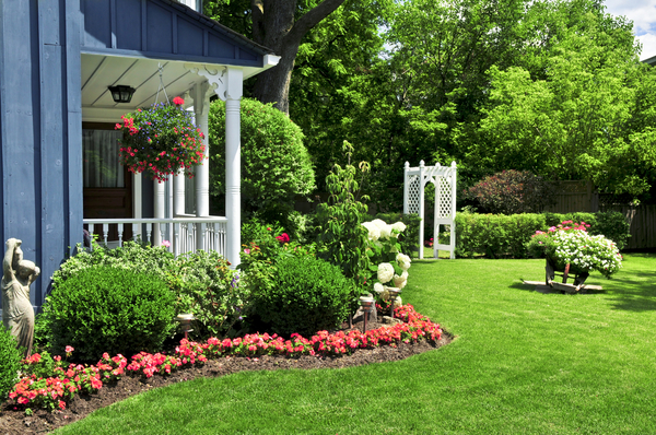
Design can be intimidating for homeowners looking to fill out their local landscape. Gardening publications are crammed with ornate displays, but how are these displays assembled? What kinds of configurations work well together, and why? Are there any governing principles that designers rely on when making these decisions? Simply put, unity in a landscaping layout refers to how well the design executes a theme. Theme, in turn, is the overall aesthetic of the landscape. When we see a design that makes use of gently curved stone, climbing vines, and lush groundcover that obscures where the landscape ends and structures begin, we might say that this design has a pastoral theme. The individual components of that design are working well together, so the design is also said to possess unity.
How is unity achieved, and what can interested homeowners do to improve their sense of design? First, careful planning is essential. Homeowners must have a concrete picture of how they would like their finished landscape to appear. From this vision, sketches and / or construction blueprints can be made that allow for adjustments. There are also several landscaping architecture software programs that permit homeowners to view their proposed designs in three dimensions. Though the textures used in such models will not be photorealistic, they can still be immeasurably helpful in determining the effectiveness of a design prior to actual construction.
If a cohesive theme is what produces the perception of unity in the viewer, then how is a cohesive theme achieved? Theme can be further broken down into several discrete parts. Scale in a landscape, for example, refers to both the size of individual features and how portions of the landscape transition into other parts. If there are wild discrepancies in size among the plants, viewers may walk away with the impression that Lewis Carroll had tried his hand at landscaping. Careful contrast in scale can be powerful, but wild contrast in scale is perceived as chaotic. Likewise, texture is another element in the landscape that must be carefully modulated. Plants with vastly different textures are sometimes placed next to each other, producing a jarring transition. Spacing and groundcovers can help ease the eye when transitioning from one texture to the next.
Even more prevalent than scale and texture, however, is the line. Lines of plants do not naturally occur, so our eyes are captivated by any lines created via straight planting. In the landscape, this often translates into property markers?rigid division along property lines creates the perception of order. Lines also have tremendous power as focal points. Short lines of plants can be used wherever the homeowner wishes attention to be drawn, such as gates, driveways, and entrances. As such, when line, texture, and scale work together to create a common theme, the viewer perceives unity in the design.
Tags: unity, landscape, design, homeowner, scale, texture

